Embroidery Thread Color Matching: Pantone, RGB, and Customer Swatch Methods
Why Color Matching Is Harder Than It Looks
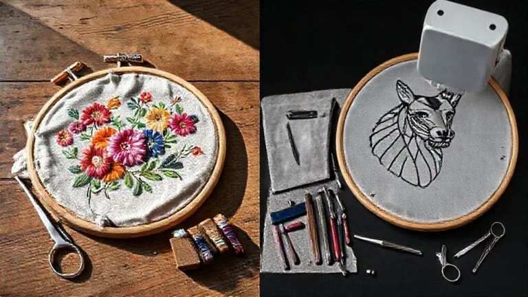
Color matching in embroidery is difficult compared to digital printing. Thread color is affected by twist, sheen, fiber content, stitch direction, and how the embroidery catches light. Understanding the tools and methods available is essential for anyone producing embroidery against brand color specifications.
Thread Brand Color Systems
Major thread brands publish their own color numbering systems and most digitizing software includes cross-reference charts. Madeira, Robison-Anton, and Isacord are among the most used. A given Pantone color does not map to a single thread number uniformly — each brand makes its own interpretations. Use brand-specific conversion charts rather than generic Pantone-to-thread lookups.
Using Software Color Conversion Tools
Most professional digitizing software (Hatch, Wilcom, Embrilliance) includes built-in tools for matching RGB or Pantone values to thread colors. Enter the target value, select the thread brand in your library, and let the tool suggest the nearest match. Then compare the suggested thread against a physical swatch or Pantone book under neutral daylight before committing to production.
Physical Swatch Matching
When a customer provides a physical swatch, pull 5-6 candidate thread spools and stitch a small test on the same fabric type as the final garment. Compare the stitched sample against the swatch under three light conditions: daylight, fluorescent office light, and incandescent. Color that matches under all three is a reliable match.
Practical Tips
For brand-sensitive customers, provide a stitched sample for approval before any production run. This is standard industry practice for orders where specific brand colors are specified. Keep a record of approved thread numbers so you can match exactly on future orders.